oembed로 유튜브를 보면 가로 크기가 컨텐츠영역에 꽉 차게 (길게 늘여져서) 보이는 문제점이 있는데,
쭉 찾아보다 보니 oembed.js 파일에 해당 부분이 있는 거 같더군요.
일단 유튜브 oembed 걸린 걸 보면
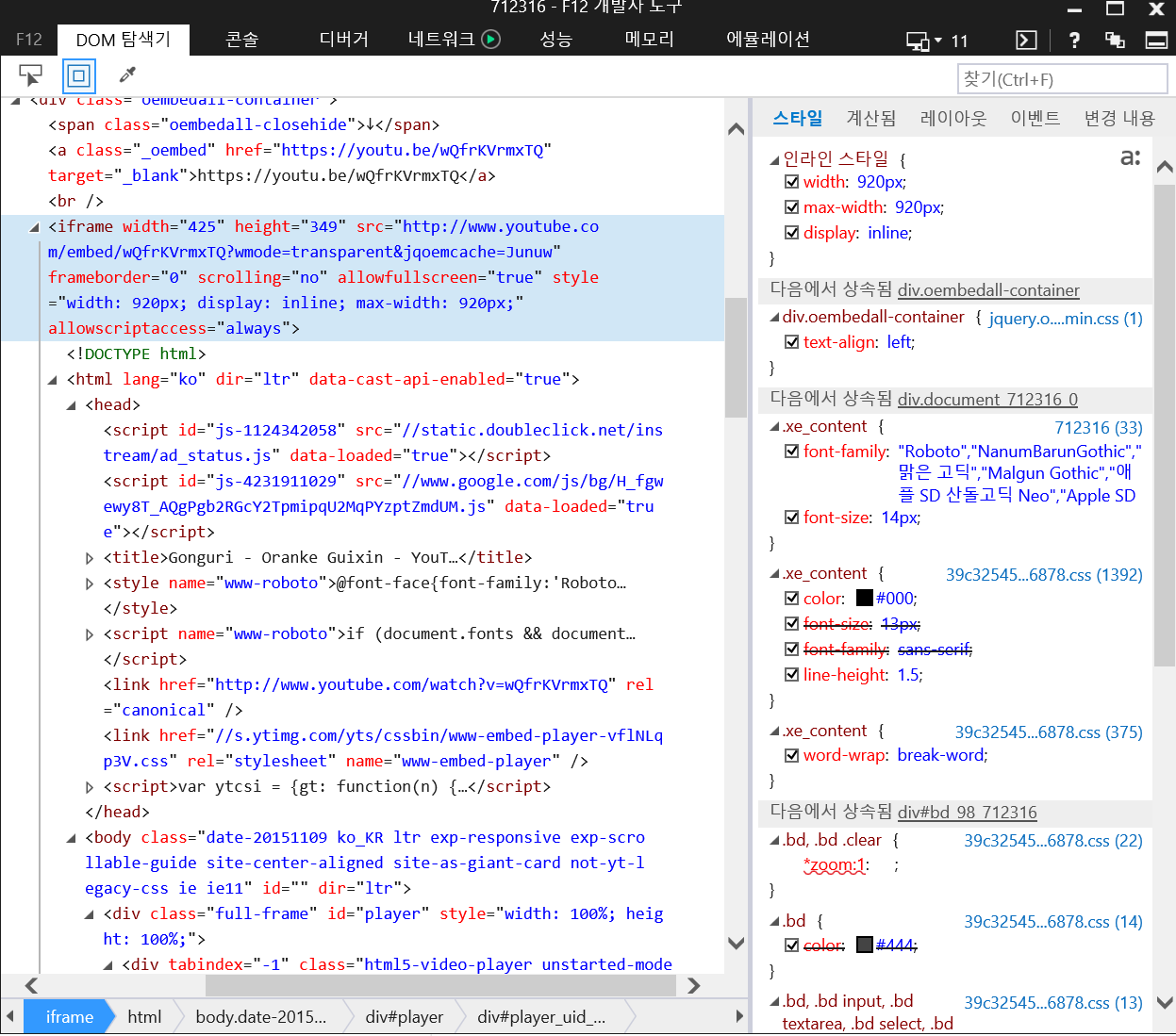
이런 식으로 되어 있는데, 저기 보면 iframe 태그 첫부분에 width="425" height="349" 라는 부분이 있는데, 밑에 보면 style="width=920px; max-width=920px" 라는 부분이 생성되어 있습니다.
처음 425 349 부분은 찾아보니까 jquery.oembed.js 파일에 있는 기본값인데, 뒤에 달린 스타일 태그 부분은 oembed.js 파일에 max-width 부분인거 같더군요.
oembed.js 파일에 해당 부분을 보면
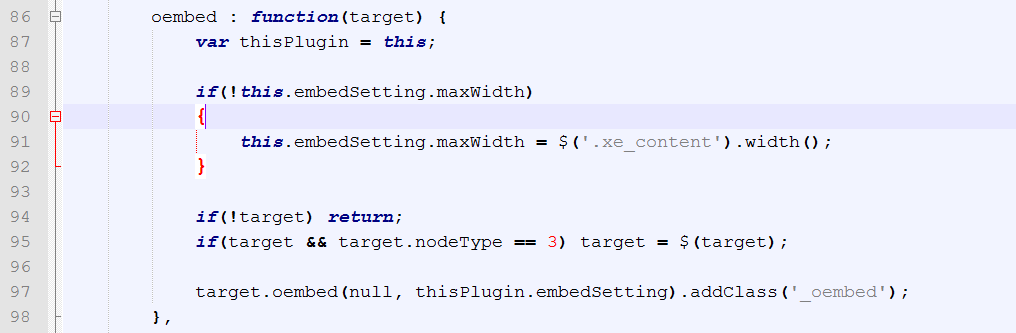
이렇게 되어 있는데, 확인해 보면 저희 사이트 컨텐츠영역 본문 넓이가 920px이더군요.
즉 이 부분 때문에 뒷부분 style= 이하 부분이 생성돼서, 앞부분의 넓이/높이 정의부분을 무시하게 되어서 동영상이 가로로 길게 나타나는 문제가 생기는거 같은데
이걸 없애주려면 어떻게 해야 하나요?
자바스크립트는 하나도 몰라서 잘 모르겠네요 (저 구문이 정확하게 무슨 말인지도 모르겠고...)
조언좀 부탁드립니다.


![스크린샷(78).png [File Size:171.6KB/Download:20]](/files/download/link/681284/dffc03337656b1828117d0eaad7816a4/%EC%8A%A4%ED%81%AC%EB%A6%B0%EC%83%B7%2878%29.png)
![스크린샷(79).png [File Size:27.1KB/Download:14]](/files/download/link/681285/d752b69e8267e8f4a8ab24f97a6a2f38/%EC%8A%A4%ED%81%AC%EB%A6%B0%EC%83%B7%2879%29.png)
댓글 21
가장 좋은 방법은 제가 만든 멀티미디어 컨텐츠에 내장된 iframe.js를 사용하는 것 입니다.
소스입니다.
게시물에 있는 iframe 크기를 현재 content 크기 보다 커지지 않게 자동 리사이즈 처리 해주며,
반응형에도 능동적으로 작동합니다. 또한 처음 출력시 크기를 기억하기 때문에, 설정된 크기 이상으로 커지진 않습니다.
var res;
$(document).ready(function()
{
resizeTarget();
});
$(window).resize(function()
{
if(res) clearTimeout(res);
res = setTimeout(function(){resizeTarget()},300);
});
function resizeTarget()
{
IframeResize('iframe:visible');
}
function IframeResize(target)
{
var xe_content = $('.xe_content');
xe_content.each(function()
{
var $iframe = $(this).find(target);
if($iframe.length < 1) return;
$iframe.each(function()
{
//var component = $(this).attr('data-component');
//if(component != 'multimeidea_contents') return;
var bwidth,
bheight,
_w,
_h,
framesize,
per;
_w = $(this).width();
_h = $(this).height();
bwidth = $(this).attr('data-width');
bheight = $(this).attr('data-height');
framesize = $(this).closest('.xe_content').width();
per = framesize / bwidth;
if(framesize < _w)
{
$(this).animate({width:framesize,height:bheight*per},{duration:400,queue:false});
}
else if(framesize < bwidth)
{
$(this).animate({width:framesize,height:bheight*per},{duration:400,queue:false});
}
else if(framesize > bwidth)
{
$(this).animate({width:bwidth,height:bheight},{duration:400,queue:false});
}
});
});
}
}) (jQuery);
위의 파일을 iframe.js(예)로 저장한 후 사용에 필요하신 부분에 불러오도록 하시면 됩니다.
사실 지금 문제가 그게 아니라... 처음 페이지를 로딩했을 때 동영상의 넓이가 컨텐츠영역 넓이(여기서는 920px)로 출력되는 부분입니다. 위에 보시면 style="width=920px" 라는게 나타나는데...
앞부분엔 width="425" 라고 되어 있는데, 저 뒤에 저 부분이 달리는 바람에 동영상이 가로로 길게 늘어나 버립니다.
이걸 없애고 싶은데... 어떻게 해야 할지 모르겠네요.
(가만 찾아보니, oembed.js 파일에 있는 구문은 max-width 관련된거 같네요. 그냥 width는 저거랑은 상관없는거 같은데...)
약 234번째 줄에
attr('width', width)
attr('height', height)
이게 있는데 이걸
css('width', width)
css('height', height)
이렇게 바꾸거나
그냥
추가해주세요
그리고 min.js 파일이 있으면 min.js로 실행되니까 삭제해버리세욧... (아니면 min.js 파일에서 찾아서 똑같이 수정해주세요)
혹시 이거랑은 관련 없나요?
* If parent div width less than embeded iframe video then iframe gets shrunk to fit smaller width
* If parent div width greater thans embed iframe use the max widht
* - works on youtubes and vimeo
*/
if(settings.maxWidth) {
var post_width = oembedContainer.parent().width();
if(post_width < settings.maxWidth) {
var iframe_width_orig = $('iframe', oembedContainer).width();
var iframe_height_orig = $('iframe', oembedContainer).height();
var ratio = iframe_width_orig / post_width;
$('iframe', oembedContainer).width(iframe_width_orig / ratio);
$('iframe', oembedContainer).height(iframe_height_orig / ratio);
} else {
if(settings.maxWidth) {
$('iframe', oembedContainer).width(settings.maxWidth);
}
if(settings.maxHeight) {
$('iframe', oembedContainer).height(settings.maxHeight);
}
}
}
$('iframe', oembedContainer).height(iframe_height_orig / ratio);
이 부분을 지우면 될 것 같기도..
width랑 height() 이게 style 태그의 width와 height을 추가하는 듯하네요
근데 만약 width height 값이 없을 때 문제가 될지도..?
아래로 내리다 보면
$.fn.oembed.providers = [
//Video
new $.fn.oembed.OEmbedProvider("youtube", "video", ["youtube\\.com/watch.+v=[\\w-]+&?", "youtu\\.be/[\\w-]+", "youtube.com/embed"], 'http://www.youtube.com/embed/$1?wmode=transparent', {
templateRegex: /.*(?:v\=|be\/|embed\/)([\w\-]+)&?.*/,
embedtag: {
tag: 'iframe',
width: '560',
height: '315'
}
}),
이런 부분이 있는데, 저기에 width와 height를 설정해 주니까 그대로 출력되는거 같네요. 위에서 알려주신 iframe.js도 같이 적용해서 그런지 모바일에서 보니까 넓이가 알아서 줄어들어 있네요.
감사합니다
반대로 키우면 비율대로 커지는데, 처음 크기 이상으로는 커지지 않는 게 장점이죠..!
엇 그럴리가 없을텐데욥..?! 잉???
https://xetown.com/index.php?mid=square&category=4300&document_srl=72830
이거 줄여보시면 아시겠지만 다시 커지는뎅....! 물론 처음 크기 이상으로 커지진 않구요
각각 처음 올렸을때, 창 크기를 줄였을때, 창크기를 다시 늘렸을때 모습입니다. 창을 줄일 때는 가로폭에 맞게 줄어드는데 비율대로 줄어드는 게 아니라 가로 크기만 줄어들고, 다시 창을 늘이면 저렇게 줄어들은 모습 그대로네요.
잘못 적용한 걸까요? 저기 위에 올려주신 그대로 iframe.js로 저장하고 스케치북 게시판 js 폴더에 넣은 다음 list.html 파일 최상단에 <load target="js/iframe.js" type="body" /> 라고 추가해줬는데...
아 그럴 수도 있겠네요.. ㅇㅅㅇ;;;;
제건 iframe 기준으로 줄이니까... 그렇다면 안쓰시는 게 좋을 것 같음;;ㅇ;;;
스케치북 게시판 때문인가 했는데, 여기 게시판도 스케치북이라서 좀 이상하네요.
그 위에 동영상을 높이 100% 넓이 100% 처리합니다.
어차피 이미지가 가변에 맞게 사이즈 잡아 두니까 그걸 기준으로 넓이 처리하면 별 문제 없더군요.